
Hey there, growth enthusiasts! 👋
Today we’re going on a wild ride through Wix’s journey, and it’s one heck of a rollercoaster.
While they’ve hit insane heights with $1 billion in ARR and a $15 billion market cap, their path was littered with epic marketing fails.
From a disastrous WordPress diss track that sparked an all-out fan war to a “Wix Code” fiasco that had developers banging their heads, Wix made more than a few missteps (More on that in the Acquisition section).
But like a phoenix rising from the ashes, they bounced back spectacularly.
In this juicy playbook, we’ll dive deep into Wix’s biggest blunders and the win strategies that allowed them to overcome and dominate the website-building world.
Get ready for an unfiltered, warts-and-all look at one of SaaS’s most legendary growth tales!
The Idea💡
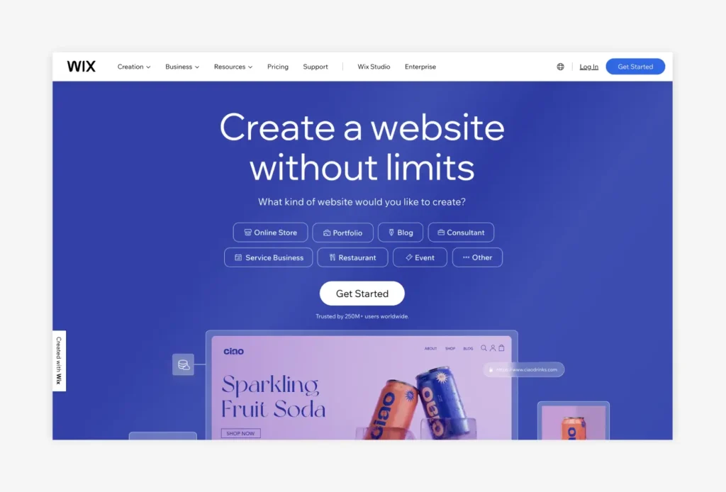
It all started back in 2006 when the website creation scene was about as exciting as watching paint dry.
Wix rolled up their sleeves and said, “Nah, fam, we can do better than this!“
They had this wild idea:
What if creating a website was as simple as playing with building blocks?
Wix wanted to flip the script and make website building accessible to everyone, even if you thought CSS was some kind of fancy coffee drink.
They set out to create a platform so user-friendly that anyone could whip up a website that looked like it was made by a seasoned pro.
The Problem 😫

Before Wix burst onto the scene, trying to create a website was like navigating a maze blindfolded while juggling flaming chainsaws.
If you weren’t a coding wizard or a design guru, you were pretty much out of luck.
The existing website builders were clunkier than a ’90s flip phone, and the learning curve was steeper than Mount Everest.
This is the problem Wix wanted to solve and swoop in like a superhero in a cape made of HTML and CSS.
The MVP 🛠️
So, how did Wix plan to solve this problem?
They knew they needed to create something that was as easy to use as a microwave but with the power of a full-blown website creator.
They put their heads together and cooked up their secret sauce:
The Wix Editor.
This drag-and-drop editor was meant to help you create a website with no code experience.
You could just point, click, and bam – you’ve got a super professional website.
So Wix made sure their MVP was loaded with all the features you needed to create a website:
- Hundreds of templates that made your site look like a million bucks
- Customization options that let you tweak every little detail to perfection
- Built-in tools for everything from e-commerce to booking appointments
And the best part?
You didn’t need a PhD in computer science to make it all work.
Of course, the MVP wasn’t perfect – there were a few kinks to iron out and some features that were still a bit rough around the edges.
But hey, that’s the beauty of an MVP – it’s not about being flawless, it’s about getting something out there and seeing how people react.
Product-Market Fit 🎯
Within just a year of launching, Wix had already 1 million users.
That’s right – 1 million people jumping on the Wix bandwagon!
But Wix didn’t rest.
They kept a laser focus on what their users wanted, gathering feedback and making tweaks to their platform like a well-oiled machine.
And it paid off big time!
By 2014, Wix was rocking over 50 million users worldwide and 45,000 new signups every single day.
The secret to their success?
A combo of ease-of-use and customization options that let anyone create a pro-looking website.
Throw in some seriously competitive pricing, Wix found its PMF.
Sure, there were a few hiccups along the way (like that cringey “Wix Code” fail), but overall, Wix had found their sweet spot in the market.
They knew who their customers were (well, eventually), what they wanted, and how to give it to them.
Positioning & Branding 🎨📐
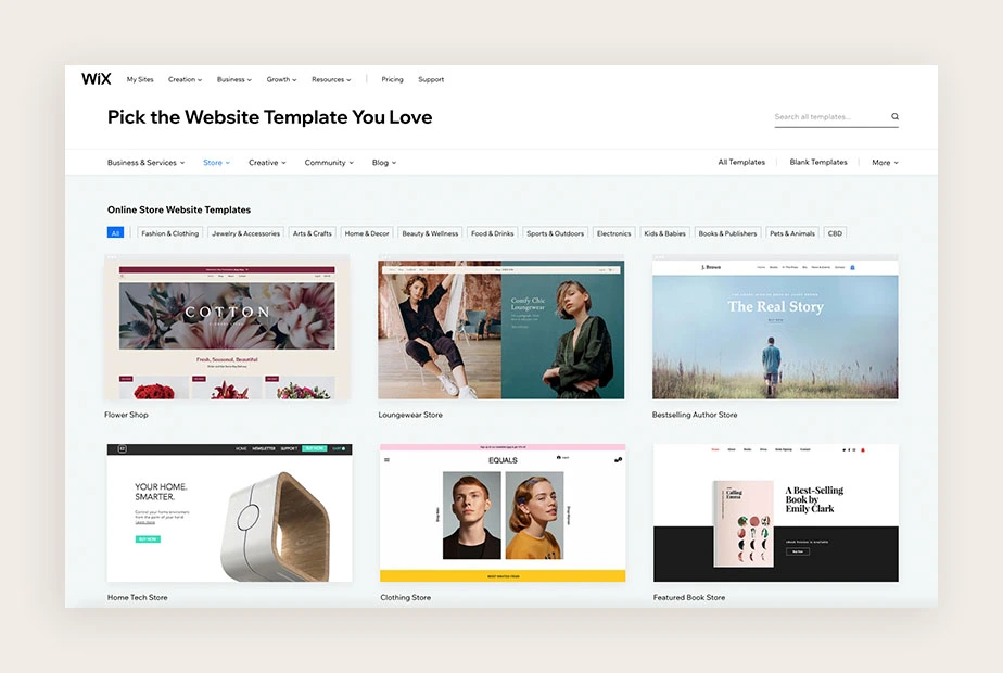
Wix has positioned itself as the go-to platform for anyone who wants to create a website without any technical hassles.
So they used a brand voice that is friendly, approachable, and all about empowering people to express their unique style and personality through their website.
Simplicity is at the core of Wix’s positioning.
They’ve made it clear that if you can drag and drop, you can create a website that looks like it was made by a pro.
And with their playful and vibrant branding, Wix has managed to make website creation feel fun and creative.
Pricing 💰📊
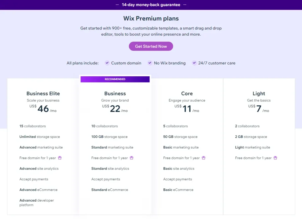
Wix offers a range of pricing options to suit every budget.
Their free plan lets you create a website at no cost but with some limitations.
Premium plans start at just $11 per month, offering features like custom domains and analytics.
For businesses and e-commerce, Wix has powerful plans (up to $149 per month) with advanced features like abandoned cart recovery and multiple payment options
And if you’re not satisfied?
No worries – Wix offers a 14-day money-back guarantee, so you can try them out risk-free.
Acquisition 🚀📈
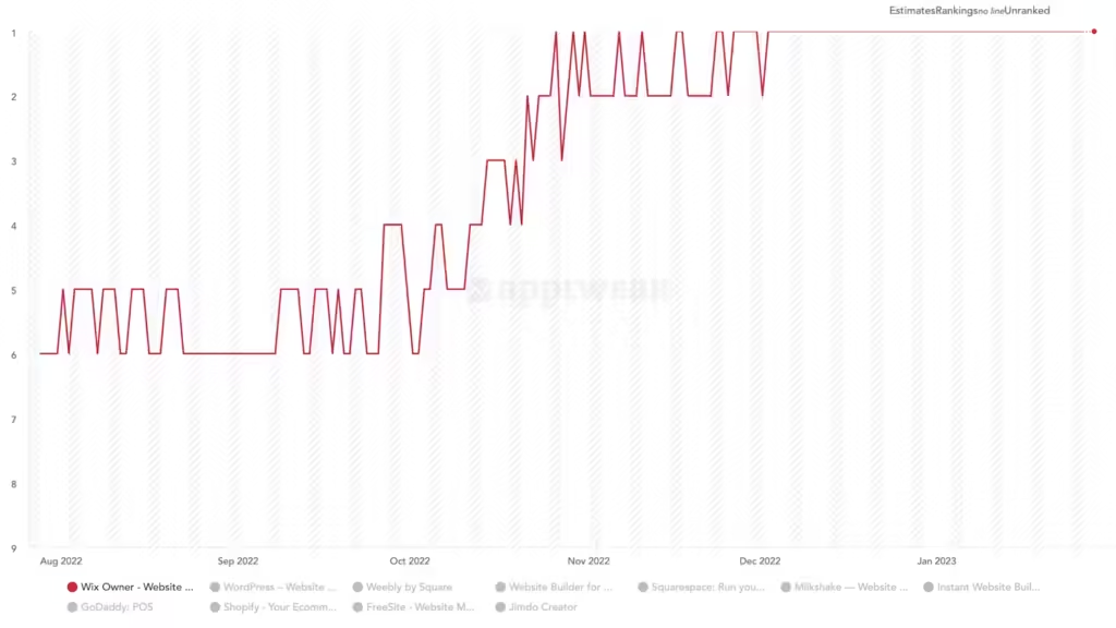
First, let’s address the elephant in the room: Wix’s marketing fails.
They’ve had their fair share of blunders that made us wonder what they were thinking.
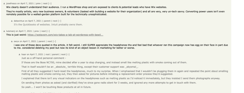
Like that time, they tried to take a jab at WordPress with a cheeky ad campaign.

Oh boy, did that backfire!
WordPress fans went on the warpath, leaving Wix with a digital black eye.
Not a great look.
And let’s not forget about the “Wix Code” fiasco.
They thought they could win over developers by letting them tinker with the platform’s code.
But instead of a game-changer, it was more like a glitch-fest that left devs banging their heads against their keyboards.
Yikes!
But here’s the crucial lesson:
Even the biggest brands stumble sometimes.
The real test is how you bounce back from those missteps.
And in Wix’s case, they didn’t just recover – they absolutely crushed it.
Rather than dwelling on their marketing misfires, Wix doubled down on what really mattered:
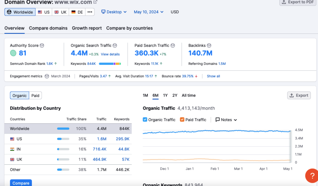
For starters, their SEO game is on point.
Wix is ranking for 1.9 million keywords and raking in an estimated 11.3 million organic visits per month.
That’s like having the entire population of Belgium knocking on their virtual door every 30 days!
And let’s not forget about their secret weapon: product-led growth.
With a free plan and an onboarding process smoother than butter, Wix makes it easy for users to dive in and get hooked.
So, while Wix’s acquisition journey has had its fair share of facepalm moments, they’ve managed to weather the storms and come out on top.
By combining SEO, product-led growth, and referral programs, Wix has created an acquisition formula that’s the stuff of SaaS legends.
Growth Loops 🔄🚀
Wix used not one but two growth loops that’ll make you wonder why you didn’t think of them first.
So let’s take a closer look at these bad boys!
The “SEO-Optimized Content” Loop of Awesomeness
– Input: Imagine a curious soul on the hunt for tips to create a website. They stumble upon a Wix blog post that’s ranking higher than their self-esteem after a pep talk from Tony Robbins. This post is packed with value and guidance on how to do it.
– Activation: Our intrepid hero clicks through to the blog post and falls down the rabbit hole of Wix’s content. They find step-by-step guides that make on how to create a website without code and links to Wix templates.
– Action: Hooked on Wix’s content and the ease of getting started, our hero signs up. They signup for a paid plan and use a website template that could make even the most website look like a masterpiece.
– Output: With the income from the signup Wix creates new SEO optimized content that ranks on SERP.
– New Input: This new piece of content catches the eye of other professionals and they visit the Wix blog to uncover the secrets of creating their own digital masterpieces, and the loop continues!
The “Free Plan” Product Loop of Domination
– Input: A user hears about Wix’s free website builder from a friend or spots a social media ad that promises a website without spending a dime.
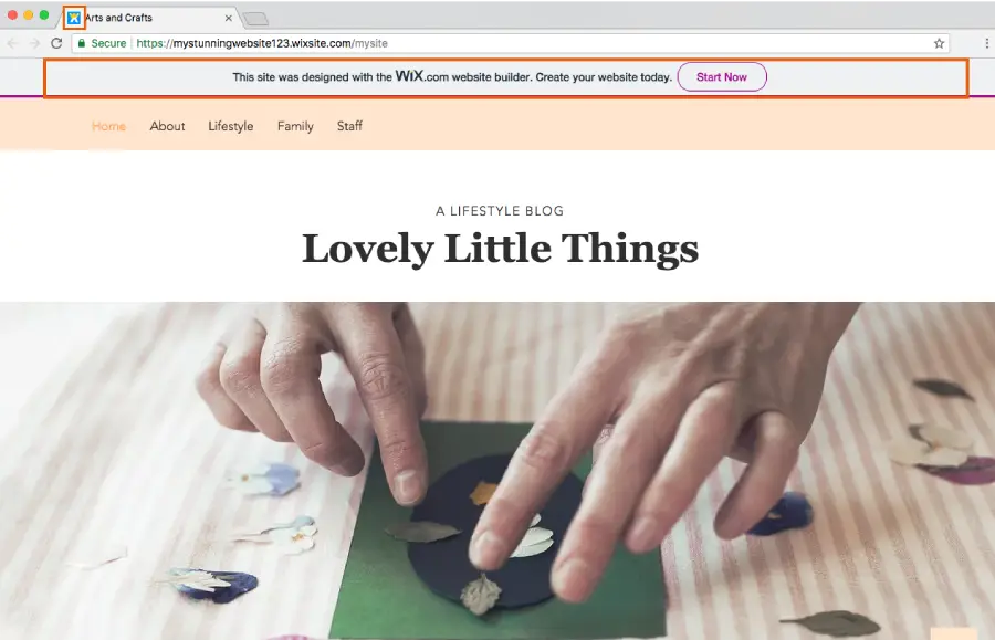
– Activation: Our curious user takes the plunge and dives into Wix’s free plan. They’re greeted with a smorgasbord of intuitive tools and default settings that include a snazzy Wix logo or favicon. It’s like having a personal web designer in their pocket!
– Action: Armed with Wix’s drag-and-drop tools, our hero creates a website. If they don’t upgrade to a paid plan the Wix branding is displayed on their website.
– Output: As our hero shares their shiny new website on every social media platform known to man, the Wix branding works its magic. Friends and followers can’t help but notice the Wix logo, and they start wondering how they can get in on the action.
– New Input: New users who saw Wix’s branding visit Wix to try their hand at building their own digital empires. They sign up, and the loop keeps on spinning like a top on caffeine!
Activation 🎬🔥
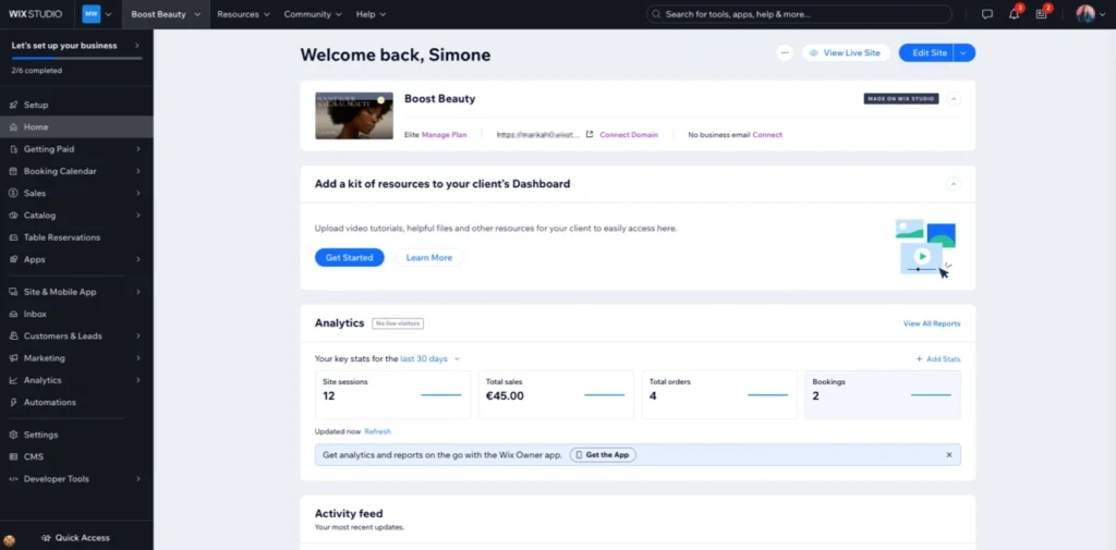
Time to talk about the moment that makes Wix users go from “meh” to “oh yeah!” – the activation stage, aka the “Aha Moment!”
This is when users realize that Wix isn’t just another pretty face in the website builder crowd.
For Wix, this moment happens when visitors use the Wix Editor!
The Wix Editor is built with a drag-and-drop functionality that makes building a website feel like a child’s play.
You can move elements around with ease, customize your site’s look, and add interactive features that’ll make your website look awesome!”
But the real secret?
Wix’s ADI (Artificial Design Intelligence) feature.
This is where Wix truly shines.
ADI takes the hassle out of website creation by generating a fully customizable site based on your answers to a few simple questions.
As users explore their freshly minted AI-generated site, they can’t help but feel a rush of excitement.
They realize that with Wix, they can create a professional-looking website in a matter of minutes without needing to know a single line of code.
This is the moment when they go from being a casual visitor to a Wix fan.
But Wix doesn’t stop there – they keep the good times rolling with their template library.
With over 500 stunning templates to choose from, users can find the perfect design for their site in a snap.
And if they feel like getting a little fancy, they can customize these templates to their heart’s content.
This is the Wix “Aha Moment” – the point where users realize that they’ve found the website builder of their dreams.
Retention 🔒❤
Wix isn’t just about creating a website and calling it a day.
They’re in it for the long haul, and they’ve got a bag of tricks that’ll make users want to stick around like glue.
First up, let’s talk about the power of personalization.
Wix knows that every user is unique, and they’re all about making their website feel like a cozy home away from home.
With features like customizable layouts, fonts, and color schemes, users can make their site look and feel exactly how they want it
But Wix doesn’t just stop at making their site pretty.
They’re also about helping them grow their online presence.
With built-in SEO tools, social media integrations, and email marketing campaigns, Wix makes it easy to get a site in front of the right people at the right time.
But perhaps the biggest retention hook of all?
Wix’s App Market.
With over 500 apps to choose from, users can add all sorts of nifty features to their site, from booking systems to chat widgets.
Referral 📣🎉

When it comes to driving growth through referrals, Wix is like a master conductor orchestrating a symphony of word-of-mouth marketing.
The numbers talk for themselves:
40% of Wix’s signups come from referrals.
That’s right, nearly half of their new users are coming from existing users who are so impressed with Wix, they can’t help but spread the love.
But how does Wix motivate their users to become brand ambassadors?
By offering a tempting referral program that rewards users for sharing the Wix love.
And the best part?
Referrals aren’t just boosting Wix’s user acquisition; they’re also driving down customer acquisition costs and increasing the lifetime value of referred users.
Lessons Learned 🎓
It’s time to break down some real-world lessons we can learn from Wix’s wild ride to website-building domination.
Lesson 1: Make That Aha Moment Unforgettable
Remember when we talked about Wix’s magical activation stage, where the “aha moment” hits users like a bolt of lightning? That’s an example of how to hook people in for the long haul. With features like the drag-and-drop Wix Editor and Artificial Design Intelligence (ADI), Wix makes creating a website feel like a walk in the playground.
The lesson? Give your users an unforgettable “aha moment” that makes them realize your product is the real deal.
Lesson 2: Content is King, But Don’t Skip SEO Class
Wix didn’t just rely on a pretty face to acquire users – they went all-in on the Content Marketing x SEO power couple. We’re talking ranking for 1.9 million keywords and raking in an estimated 11.3 million organic visits per month! By creating a content engine that would make even the biggest SEO nerds weep tears of joy, Wix solidified their place as the website creation authority.
Lesson 3: Double Down on Those Growth Loops
Speaking of user acquisition, let’s talk about Wix’s two epic growth loops that just keep on giving. The “SEO-Optimized Content” loop where users find Wix’s guides, get hooked, and become paid users? Genius! And don’t even get me started on the “Free Plan” loop, where that Wix branding acts like a magnet for new sign-ups.
Your mission? Find your own juicy growth loops and nurture them like they’re your firstborn children!
Lesson 4: When the Referral Program is This Good, It’s a No-Brainer
I mean, a 50% commission for every new user referred? That’s more generous than Oprah giving away free cars! With an incentive like that, it’s no wonder a whopping 40% of Wix’s sign-ups come from good ol’ word-of-mouth.
The moral of the story? Don’t be stingy with those referral rewards – go big or go home!
Lesson 5: You Gotta Play the Long Game
From personalization tools that make your site feel like a custom-tailored suit to an ever-expanding App Market – Wix has more hooks than keep users engaged for the long haul.
The key takeaway? Don’t just focus on acquisition – build an ecosystem that’ll have your users sticking around like they’re paid to do so!
What an epic ride through Wix’s wild world of growth!
But this isn’t just their story – it’s a blueprint for anyone looking to build a product that people obsess over.
If you dug this juicy breakdown, do me a solid and share it with your friends and fellow marketers. And be sure to sign up for more must-read growth insights coming your way!
Keep growing, keep hustling – I’m out!

Leave a Reply