
Hi there, unicorns! 👋
Today, we’re diving into Figma’s growth playbook – the design tool that’s revolutionized how we create and collaborate.
From a simple idea to solve design collaboration to a $20B acquisition by Adobe, Figma has grown into the world’s leading design platform with millions of users across the globe.
But the path to the top wasn’t just about having a great product.
In this growth playbook, we’ll reveal the strategies and tactics that led Figma to success, explore its impact on the design industry, and examine the real struggles they faced – from battling industry giants to overcoming user skepticism.
Grab your cursors, and let’s hit that canvas! 🖱️🎨
The Idea💡

It was 2012 when two Brown University students, Dylan Field and Evan Wallace, stumbled upon a game-changing concept.
Frustrated by the clunky, disconnected world of design tools, they wondered:
What if you could design and collaborate in real time, right in your browser?
This idea, born from a very real need, would become the foundation of Figma.
Field and Wallace envisioned a platform that could offer the power of desktop design tools with the collaborative magic of Google Docs.
Their core concept was simple:
Create a tool that allows designers and members from other departments to work together seamlessly, regardless of their location.
The Problem 😫

Before Figma, the design world was a mess of disconnected tools and painful workflows.
Designers faced a tough choice:
Pay big bucks for clunky desktop software 💸
Struggle with basic online tools that lacked real design power 😤
Deal with the nightmare of version control and file sharing 😱
The industry was crying out for a solution.
Designers were wasting hours on email threads, endless file exports, and confusing version names (final_final_v2_for_real_this_time.psd, anyone?).
Collaboration? More like collabo-frustration.
Teams were siloed, feedback was slow, and don’t even get us started on trying to work with non-designers.
The MVP 🛠️
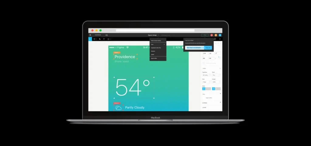
Figma’s journey to MVP wasn’t a quick sprint – it was a 3-year stealth marathon.
From 2012 to 2015, Dylan and Evan worked tirelessly behind closed doors, fueled by $3.8M in seed funding.
Their goal? Build “Photoshop in the browser.“
But creating a browser-based design tool powerful enough to challenge desktop giants wasn’t easy.
The team faced countless hurdles, from performance issues to skeptical user feedback.
“If this is the future of design, I’m changing careers,” one tester said.
Ouch. 😅
Yet they persevered, iterating relentlessly.
By late 2015, they had a basic vector editor with rudimentary sharing capabilities – just enough to prove their wild idea might actually work.
It wasn’t pretty, but it was a start.
Product-Market Fit 🎯

Figma’s journey to product-market fit was a gradual process of expanding its service and user base.
But the real breakthrough came with one crucial customer: Coda.
The Figma team was maniacal about getting only one full-time customer and not expanding before they made sure they were super happy.
They found that in Coda, and they went all out to keep them happy.
Picture this:
The Figma team driving back to San Francisco after signing Coda, buzzed with excitement.
Suddenly, a call comes in – Figma’s not working at Coda! 😱
Without missing a beat, Figma’s CTO turns the car around and drives all the way back to Palo Alto to fix it himself.
Talk about dedication!
(Spoiler: It was just a network issue on Coda’s end. Phew!)
This laser focus on customer satisfaction paid off.
With Coda actually using the product full-time (with a designer of one), Figma had finally proved they were ready for prime time.
Key indicators of PMF started rolling in later:
- Rapid user growth: From 1 million users in 2016 to 4 million by 2022
- Strong engagement: Users spending hours on the platform
Viral growth: Each new user inviting multiple friends
Positioning & Branding 🎨📐
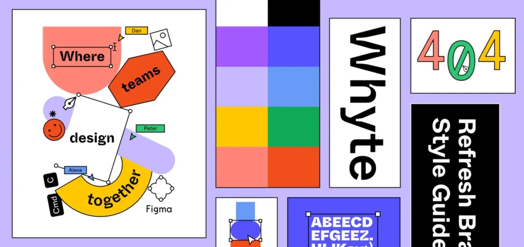
Figma positioned itself as the ultimate design companion – “Design, together” became their rallying cry.
Their branding strategy focused on:
- Collaboration: Emphasizing real-time, multiplayer design capabilities
- Accessibility: “Design for everyone” – highlighting their browser-based, freemium model
- Innovation: Positioning as a tech company, not just another design tool
Figma’s logo, a simple play button made of overlapping shapes, perfectly embodied their collaborative ethos.
Their marketing often focused on the joy of creating together, with campaigns like “Someone’s editing your file” tapping into the excitement of real-time collaboration.
Figma also positioned itself as a champion for designers, promising a platform where creativity could flourish without technical barriers.
This branding helped Figma stand out, appealing to both solo designers and large teams, while gaining street cred within the design community.
And let’s not forget their cheeky digs at Adobe.
Remember when Dylan said, “Adobe doesn’t really understand collaboration. The Adobe Creative Cloud is really cloud in name only.” 🔥 Shots fired!
Pricing 💰📊
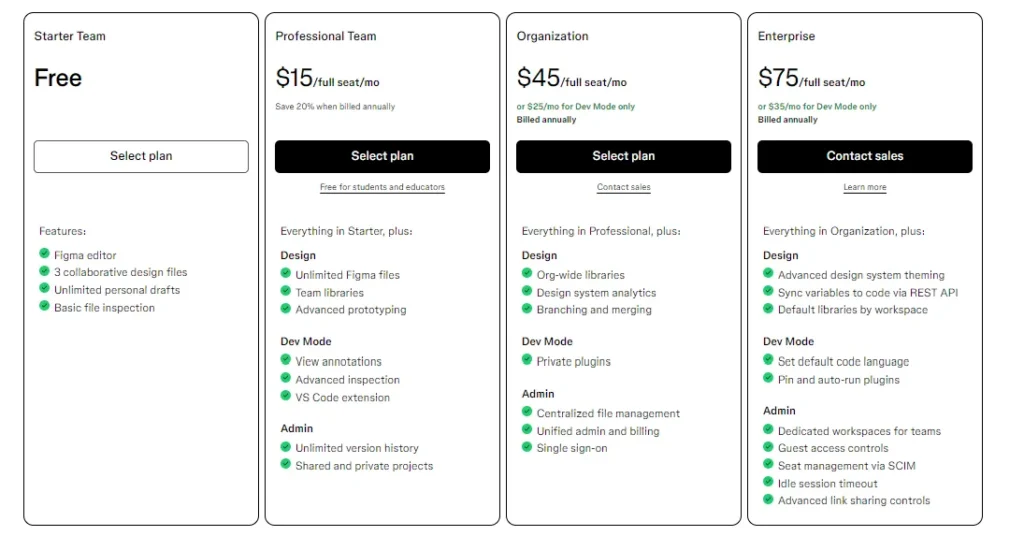
Figma’s pricing strategy?
Make it free. Like, really free.
From its launch until 2017, Figma was 100% free for everyone.
Yep, you read that right. Nada. Zilch. $0. 🤯
This “we’ll figure out money later” approach was a genius move.
It allowed Figma to spread like wildfire, especially among cash-strapped startups and freelancers.
But here’s the kicker:
Figma was so good that companies were actually begging to pay for it! 😂
Dylan tells the story of a Microsoft exec who said:
“Look, we’re all worried you’re going to die as a company. We can’t spread it inside Microsoft even though we like it, because you’re not charging.“
Talk about a good problem to have!
When Figma finally introduced pricing in 2017, they went with a freemium model:
- Free tier: For individuals and small teams
- Professional tier: For larger teams needing more features
- Enterprise tier: For big orgs needing serious collaboration power
This model served two purposes:
It kept the barrier to entry low, driving rapid user growth, and created a funnel for premium conversions.
And convert they did!
Figma’s reported a 45% conversion rate from free to paid.
In the world of freemium, that’s not just good – it’s insane. 🚀
Acquisition 🚀
Figma’s acquisition strategy was a masterclass in Product-Led Growth (PLG), community building, and strategic partnerships.
Let’s break it down with some juicy data:
Product-Led Growth:
Figma’s free – freemium model was the cornerstone of their acquisition strategy. By 2022, they had over 4 million users, with a 45% conversion rate from free to paid – that’s 5x higher than the industry average of 2-9%!
Community Building:
Figma’s community became a growth engine in its own right. By 2022, the Figma Community had:
– Over 1 million public files
– 10,000+ plugins and widgets
– Users from 200+ countries
These community contributions not only added value but also drove organic user acquisition through word-of-mouth.
Influencer Partnerships:
Figma cleverly tapped into the design influencer network. They collaborated with big names like Pablo Stanley and Meg Lewis, whose tutorials and endorsements reached millions of designers. At the same time, they worked with micro-influencers and smaller audiences.
Enterprise Adoption:
Figma’s land-and-expand strategy paid off big time. They reported a net dollar retention rate of 150% in 2021, meaning existing customers were not only sticking around but dramatically increasing their usage.
But here’s the kicker: Figma didn’t start with a sales team. They were all-in on product-led growth until 2018, when they finally built out an enterprise sales team.
As Dylan Field put it, “We were very reticent to add sales… We wanted the product to sell itself.“
But when big companies came knocking, Figma realized they needed a dedicated team to navigate complex enterprise deals. So, in 2018, they hired their first sales leader and started building a proper sales motion.
Educational Initiatives:
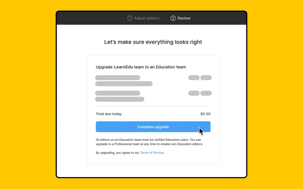
Figma’s education program was a sneaky-smart acquisition play. Launched in 2018, it offered free access to Figma’s Professional plan for students and educators. By 2022, over 500,000 students and educators across 1,500 institutions were using Figma for free.
But it wasn’t just about giving away the product. Figma created:
- A dedicated education hub with tutorials and resources
- Student design challenges with prizes
- Partnerships with top design schools like RISD and Parsons
The result?
A whole generation of designers entering the workforce already Figma-fluent.
Talk about playing the long game! 🎓
Content Marketing:
Figma’s blog became the design world’s water cooler.
By 2022, it was attracting over 1 million monthly visitors.
Here’s how they did it:
- “Design Systems” series: Deep dives into how companies like Uber and Spotify build their design systems
- “Figma Tips” posts: Practical tutorials that often went viral on design Twitter
- “Year in Review” posts: Annual roundups that garnered 200K+ views each
They also launched “Figma Community Talks,” a weekly livestream series featuring design experts, further cementing their thought leadership position.
Events and Webinars:
Figma’s annual conference, Config, became the Coachella of design events.
It grew from 400 attendees in 2019 to over 60,000 virtual attendees in 2021.
But Config was just the tip of the iceberg:
- “Figma Focus” webinar series: Monthly deep-dives into Figma features
- “Design Systems Week”: A week-long virtual event that drew 30,000+ attendees in 2021
- Local meetups: Over 250 “Friends of Figma” community groups worldwide by 2022
These events not only educated users but created a sense of belonging in the Figma community.
Strategic Partnerships:
Figma’s integration strategy turned it from a design tool into a design ecosystem. Key partnerships included:
- Slack: Real-time file previews and notifications (used by 80% of Figma teams by 2022)
- Microsoft Teams: File embedding and co-editing (reaching 250 million potential users)
- Jira and GitHub: Design-to-development workflow integrations
- Zoom: In-call collaborative design sessions
They also launched FigJam in 2021, integrating with tools like Asana and Google Calendar, expanding Figma’s reach beyond just designers.
By 2022, Figma boasted over 1,000 integration partners, creating a robust ecosystem that made Figma indispensable in modern workflows. 🔗🚀
The results speak for themselves:
- 2016: 1 million users
- 2019: 1 million paying users
- 2022: 4 million users across 180+ countries
Growth Loops 🔄🚀
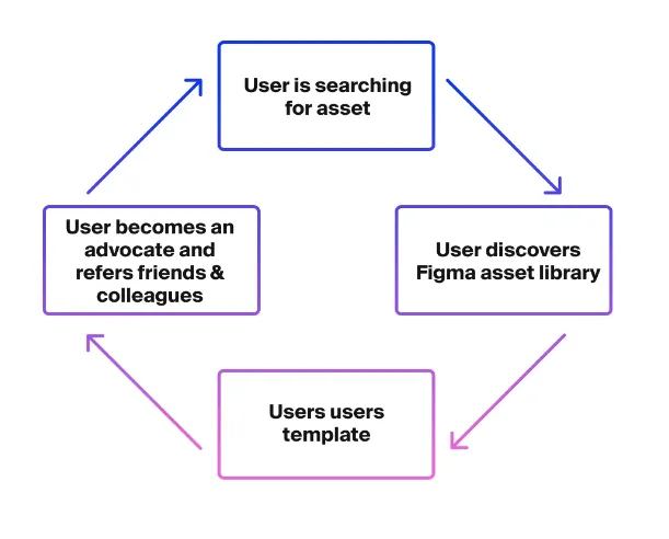
Figma’s growth was supercharged by two interconnected loops: the PLG collaboration loop and the FigJam content loop.
PLG Collaboration Loop:
- User signs up for free
- Invites team members to collaborate
- Team members join and experience Figma’s awesomeness
- They start new projects, inviting more people
- Cycle repeats, user base grows exponentially
This loop was so effective, Figma’s users became their best salespeople. One designer would bring in their whole team, then the whole company!
FigJam Content Loop (UGUD – User Generated User Distributed):
- User creates a FigJam board
- Shares board with team members or embeds it in other tools
- Recipients interact with the board, experiencing FigJam’s value
- They create their own FigJam boards for other projects/teams
- More people across the org get pulled into Figma’s ecosystem
The beauty of this loop?
Users do both content generation and distribution.
Figma just sits back and enjoys the ride (well, after initial development work).
These loops created a viral coefficient >1, meaning each user brought in more than one new user on average.
Activation 🎬🔥
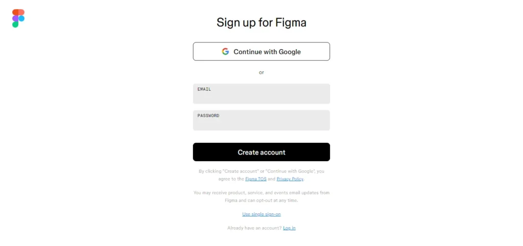
Figma’s activation strategy is all about getting users to their “aha” moment as quickly as possible.
Here’s how it goes:
- Sign up with just an email (no credit card required – nice!)
- Land in a pre-made template, ready to play
- Quick tutorial pops up, showing basic tools
- Boom! You’re designing in seconds
But here’s where Figma really shines:
The “aha” moment isn’t just about designing solo. It’s about collaboration!
Figma encourages users to:
- Invite team members right away
- Share their first design
- Comment on each other’s work
That’s when the magic happens.
Designers see their teammates’ cursors moving in real-time, comments popping up instantly, and changes syncing automatically.
It’s like watching your design come alive with teamwork. 🎨✨
This collaborative “aha” moment is what sets Figma apart.
It’s not just a design tool; it’s a design playground where teamwork happens at the speed of thought.
Retention 🔒❤
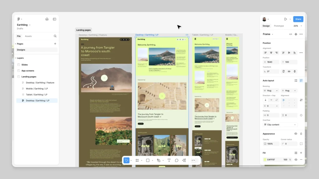
Figma wouldn’t make it without a killer retention game.
Here’s how they keep users coming back for more:
- Constant Innovation: New features drop faster than Apple product rumors
- Community Power: User-generated plugins and templates keep things fresh
- Learning Central: Figma’s resources turn newbies into ninjas
- Collaboration Magic: Real-time teamwork makes Figma irreplaceable
- Freemium Forever: Free tier keeps casual users in the ecosystem
The result?
A jaw-dropping 150% net dollar retention rate in 2021.
That means users aren’t just sticking around – they’re inviting friends to the party!
Figma isn’t just a tool; it’s a habit. And habits are hard to break, especially when they’re this good.
Referral 📣🎉

Figma’s referral strategy is a potent mix of organic word-of-mouth and an affiliate program.
On the organic front:
Designers can’t stop talking about Figma.
It’s their water cooler talk, their Twitter obsession, their go-to recommendation for every design newbie.
But Figma cranked it up to 11 with their affiliate program:
– 30% commission on qualifying purchases
– Earnings on both Figma and FigJam sign-ups
– Extra cash when users upgrade to Professional plans
– Slick brand kit for affiliates to use
The genius?
Most affiliates are already Figma fanatics.
Their recommendations come from genuine love, not just commission hunger.
Between organic buzz and this affiliate army, Figma’s turned its user base into a marketing machine on steroids.
It’s word-of-mouth, but make it profitable.
Challenges 😰
Figma’s journey wasn’t all sunshine and collaborative cursors.
Let’s dive into the hurdles they faced:
The 3-Year Stealth Struggle:
Building “Photoshop in the browser” wasn’t a walk in the park.
From 2012 to 2015, Dylan and Evan worked tirelessly behind closed doors.
Morale dipped as user feedback was… let’s say, not exactly glowing:
“If this is the future of design, I’m changing careers.”
Ouch. 😅
But they persevered, iterating relentlessly until they had something worth showing the world.
David vs. Goliath:
Entering a market dominated by Adobe, the 800-pound gorilla of design software, was like bringing a butter knife to a bazooka fight.
Adobe had decades of experience, millions of users, and pockets deeper than the Mariana Trench.
But Figma had a secret weapon: collaboration.
While Adobe was still figuring out how to spell “real-time,” Figma was enabling designers to work together seamlessly.
The Plot Twist: Adobe Buyout
Just when Figma thought they’d slain Goliath, plot twist!
Adobe offered a cool $20 billion to buy them out.
The design community lost their collective minds. 🤯
But here’s the kicker: antitrust regulators weren’t too thrilled.
Adobe had to retreat, tail between its legs, canceling the deal in December 2023 and paying Figma $1B.
Absolutely! Let’s restructure the lessons learned section in that format:
Lessons Learned 🎓
Lesson 1: Solve a Real, Burning Problem
Figma didn’t just build a better design tool; they reimagined how designers could work together in a cloud-first world.
The takeaway? Always start with a genuine pain point. The bigger the pain, the more valuable your solution.
Lesson 2: Collaboration is the Future
In a world gone remote, Figma showed that real-time collaboration isn’t just a nice-to-have; it’s essential.
The takeaway? Build for the future of work. Products that enable seamless collaboration have a massive advantage.
Lesson 3: Freemium Can Be a Growth Engine
By offering a robust free tier, Figma got their foot in the door of companies big and small, then let their product do the selling.
The takeaway? If your product delivers real value, a freemium model can drive explosive growth and word-of-mouth marketing.
Lesson 4: Community is Your Secret Weapon
Figma didn’t just build users; they built evangelists. Their community-driven approach turned customers into their best marketers.
The takeaway? Invest in community building. A passionate user base can be your most powerful growth engine.
Lesson 5: Perseverance Pays Off
Those three years in stealth mode were crucial. Figma kept iterating until they had a product worth shouting about.
The takeaway? Sometimes, you gotta trust the process. Don’t rush to market with a half-baked product. Patience and persistence can lead to exponential returns.
And there you have it!
Figma’s journey from a wild “Photoshop in the browser” idea to a $20B almost-acquisition is nothing short of magical.
They didn’t just disrupt the design world; they reimagined it.
From collaborative cursors to community-driven growth, Figma’s playbook is a masterclass in product-led growth.
They proved that with the right product, timing, and a dash of perseverance, even the mightiest incumbents can be challenged.
So whether you’re crafting the next big thing in tech or just looking to level up your product game, take a page (or ten) from Figma’s book.
And hey, if this playbook sparked any ideas, don’t keep them to yourself – share the love and spread the growth knowledge! 🚀💡


Leave a Reply